Order and Disorder
These photographers relate to order and disorder and take images that i will like to recreate and use to mold my own style of photography in the theme of order and disorder. Whether their images include organised and repeated patterns or busy, randomized dynamics to their pictures, all the shots fit in place to the theme of order and disorder.
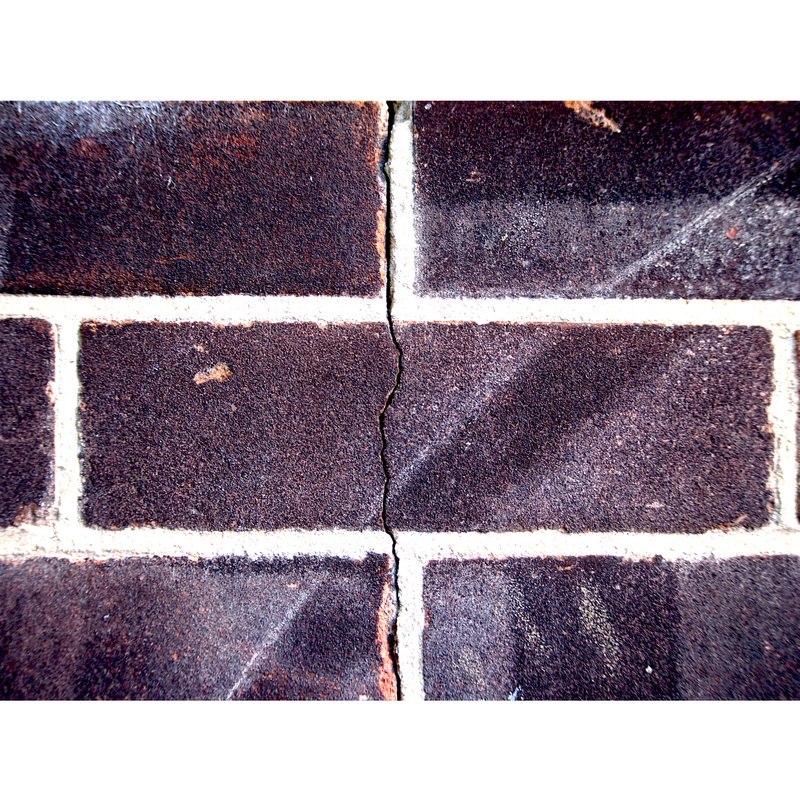
Symmetry
With this photo-set, the theme was symmetry. I used natural and man made symmetry to work along the theme. With repeated patterns and clear image splitting, symmetry is quite easy to spot and photograph.

Edits
|

|
GIF
Making animated gif's
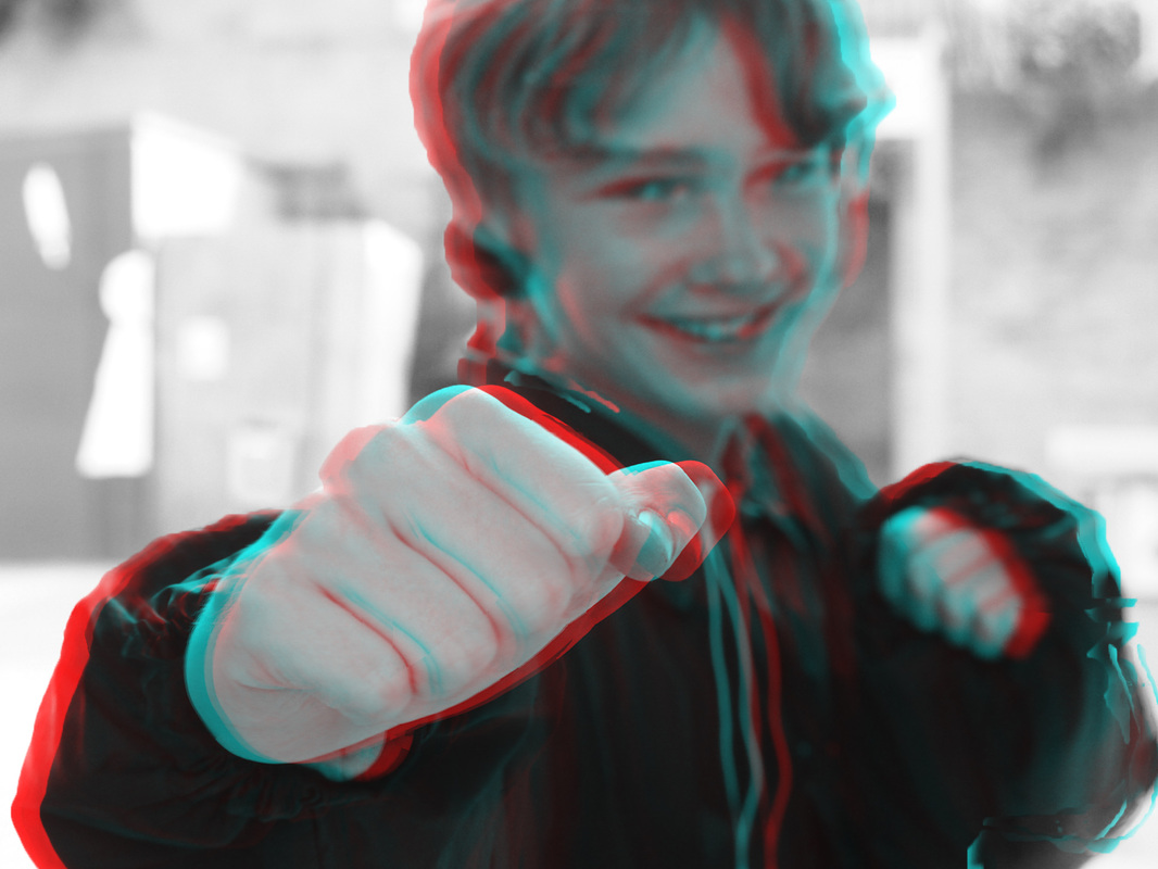
3D Image
To create this 3D image i used a process in Photoshop by creating different layers in my picture and colouring them cyan and red they create a 3D effect when viewed with classic 3D glasses. I chose to use a punching fiat as my subject so it would appear to be reaching out of the screen and make the images impact a lot more dynamic and noticeable.
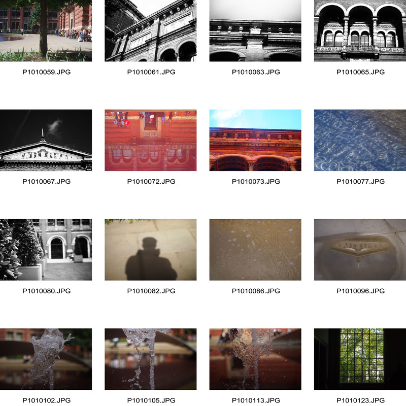
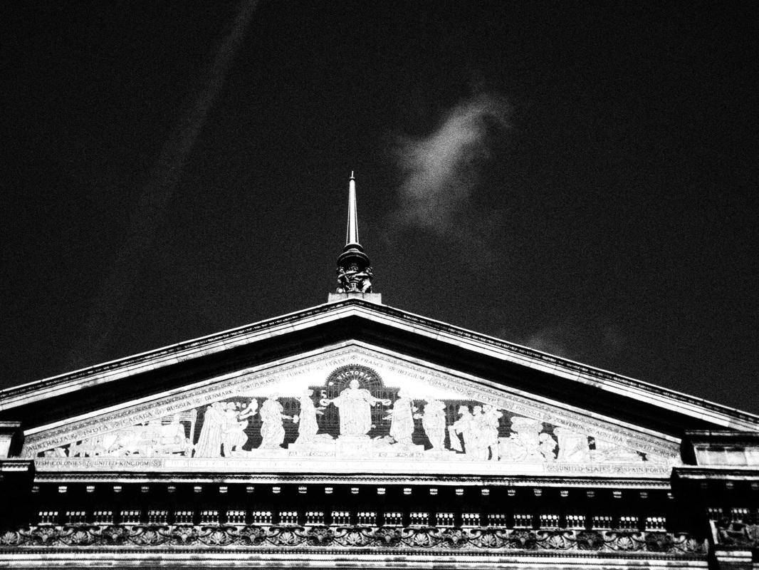
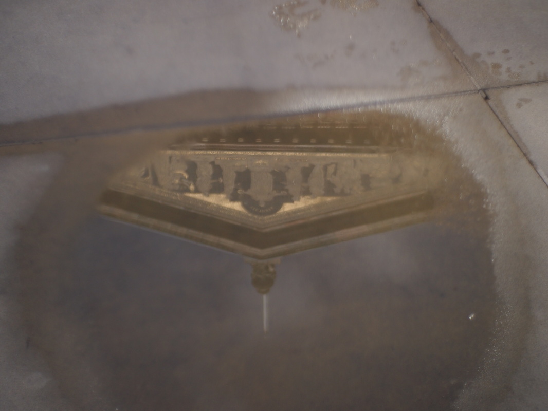
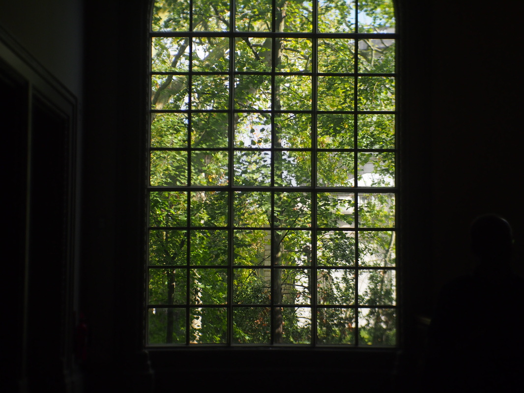
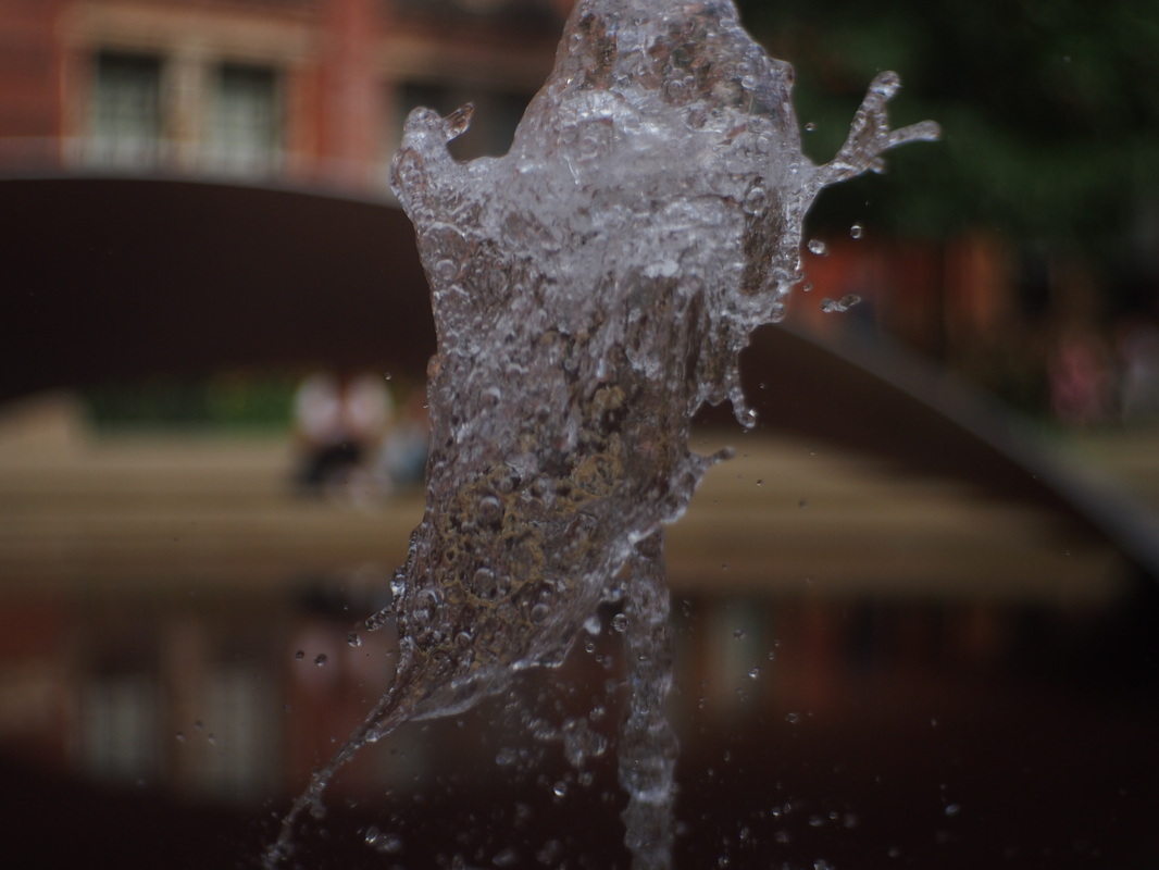
V & A Museum
When i went on my V & A Museum trip i was focusing on the exhibition that was all about the photographer Horst P. Horst (1906-99) and his work. The group all photographed the museum's campus. These are the images i gathered from my photography session:
|
|
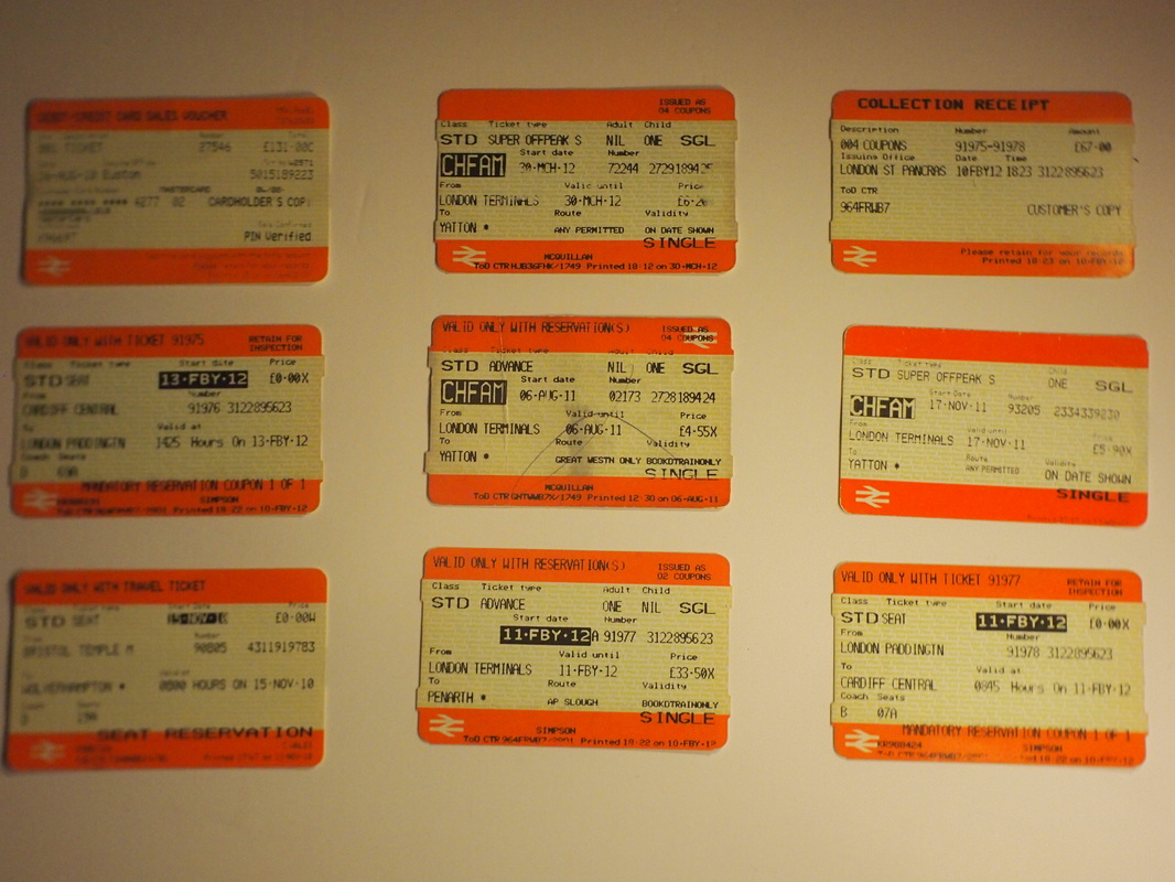
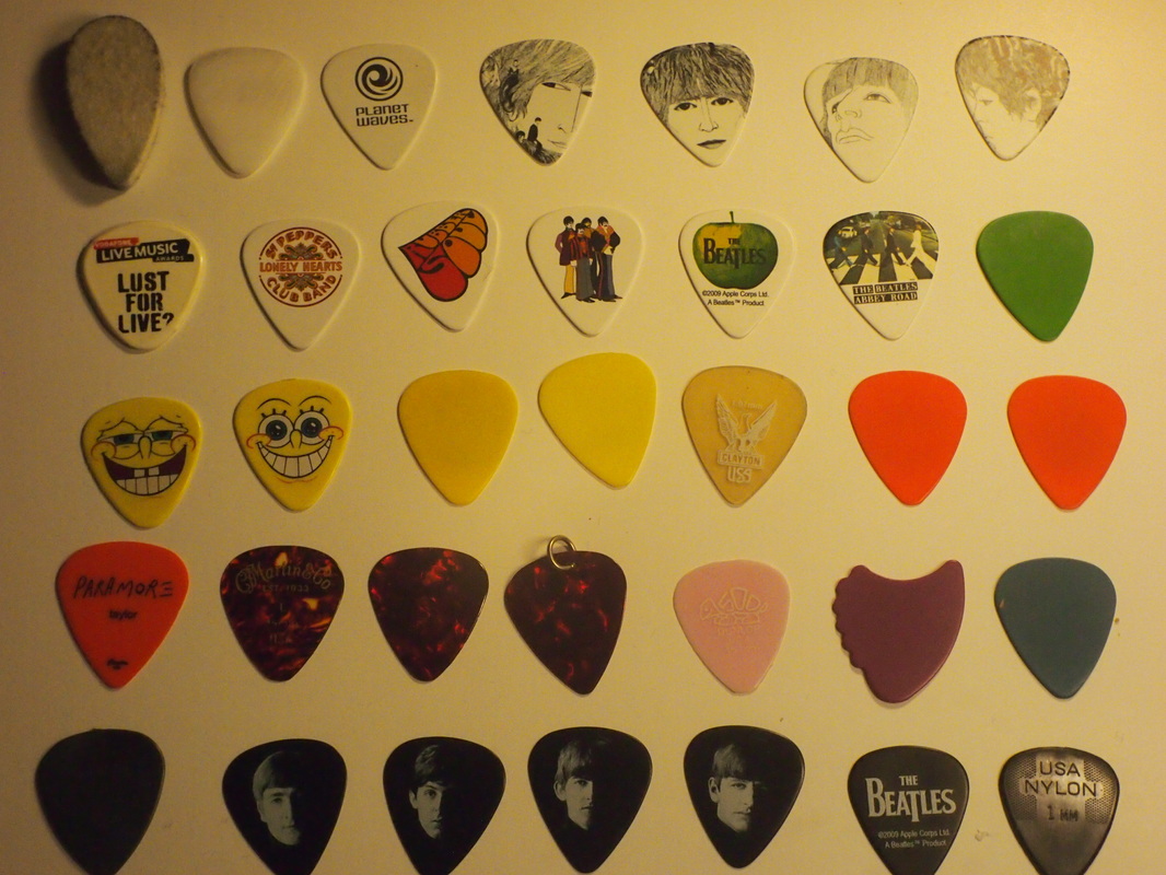
Typology
Part 1: Brands
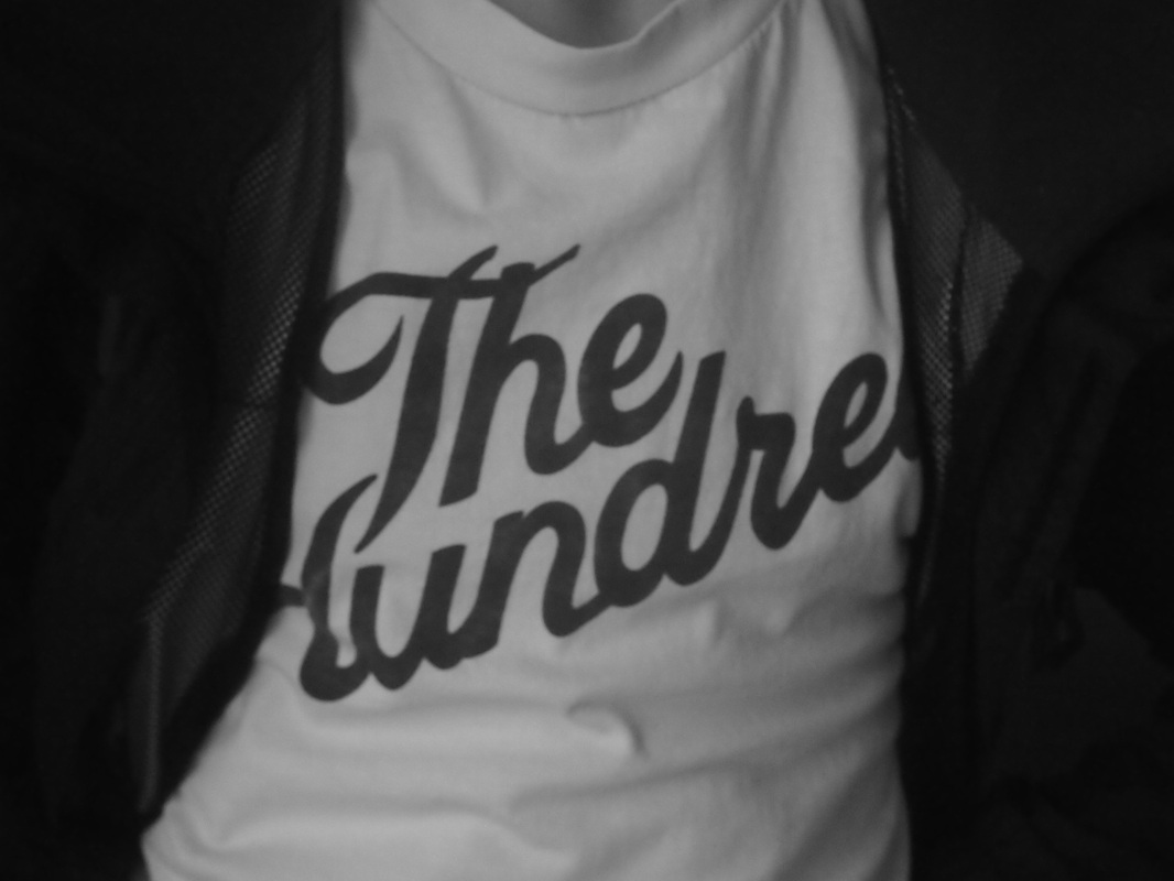
With my typology project i decided to focus on brands. Different brands show different fashion senses and show how people use fashion to show their personalities and personal taste. I took pictures of peoples clothing as it could lead and guide the viewer to judging someones personality and fashion sense by the brands they wear, this leads to different interpretations for different people.

|
|

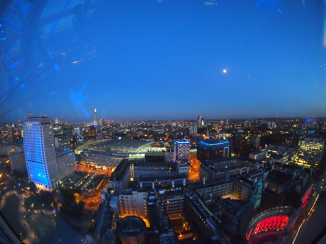
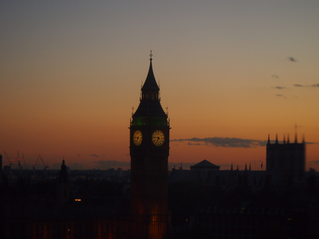
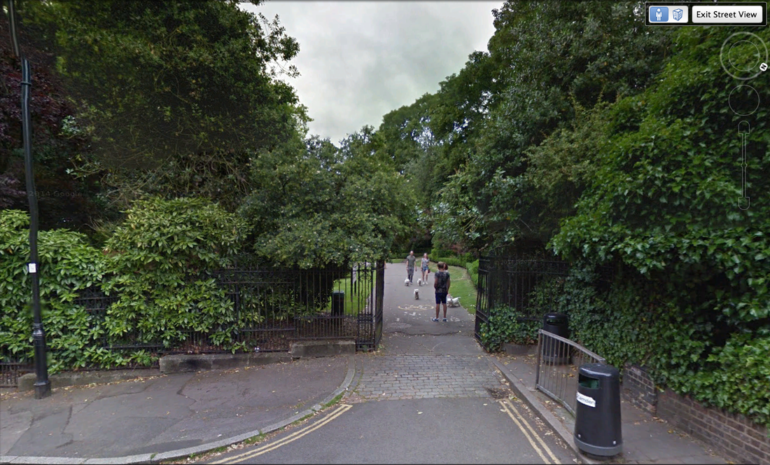
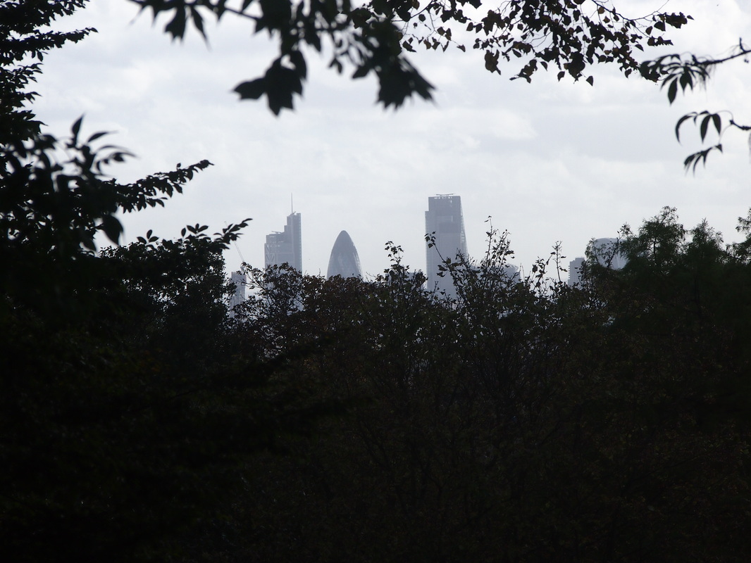
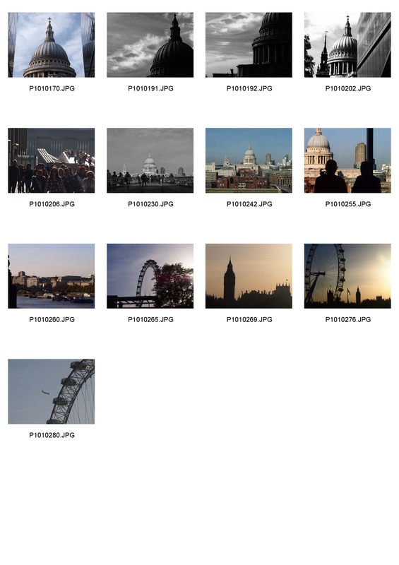
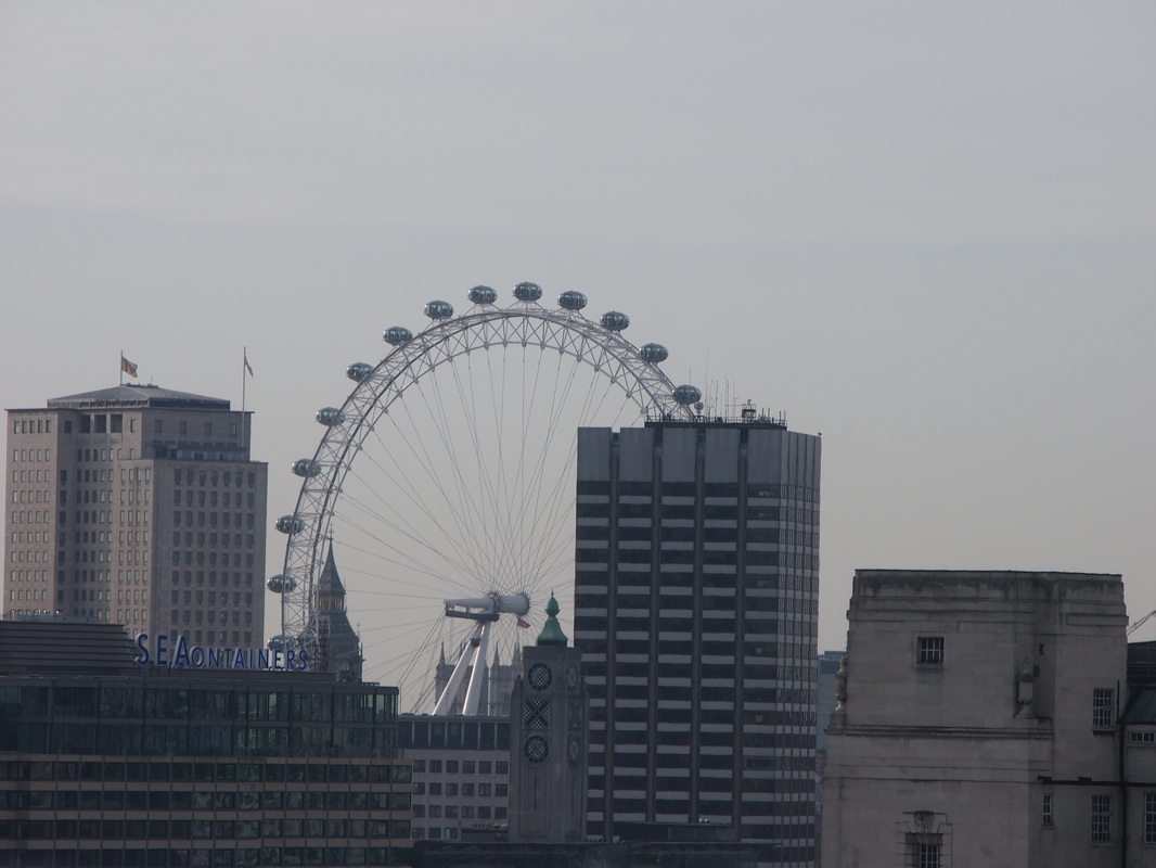
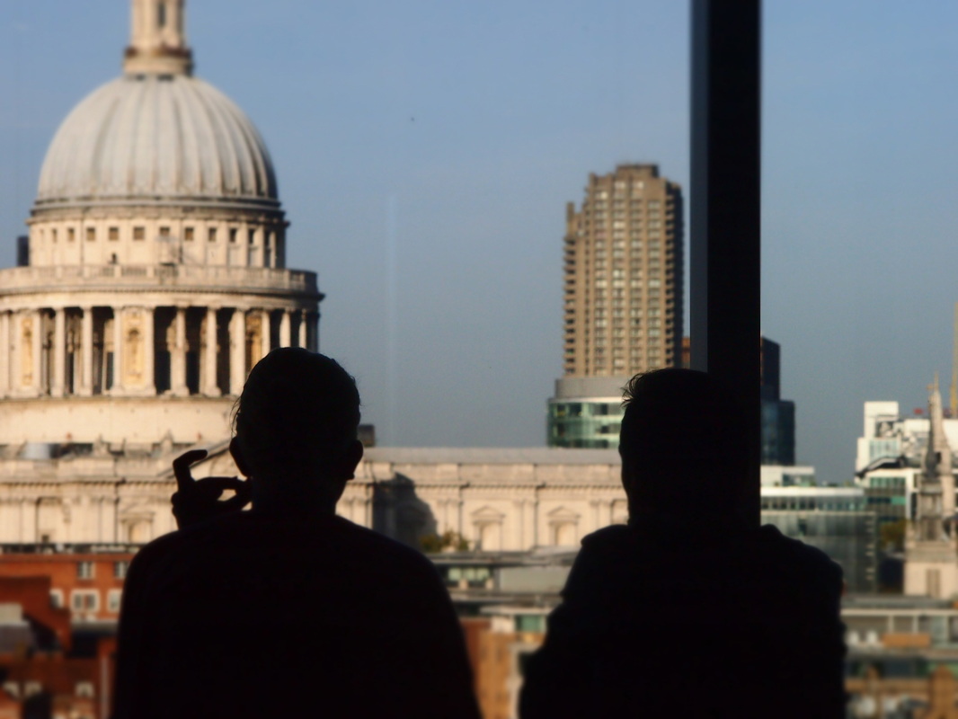
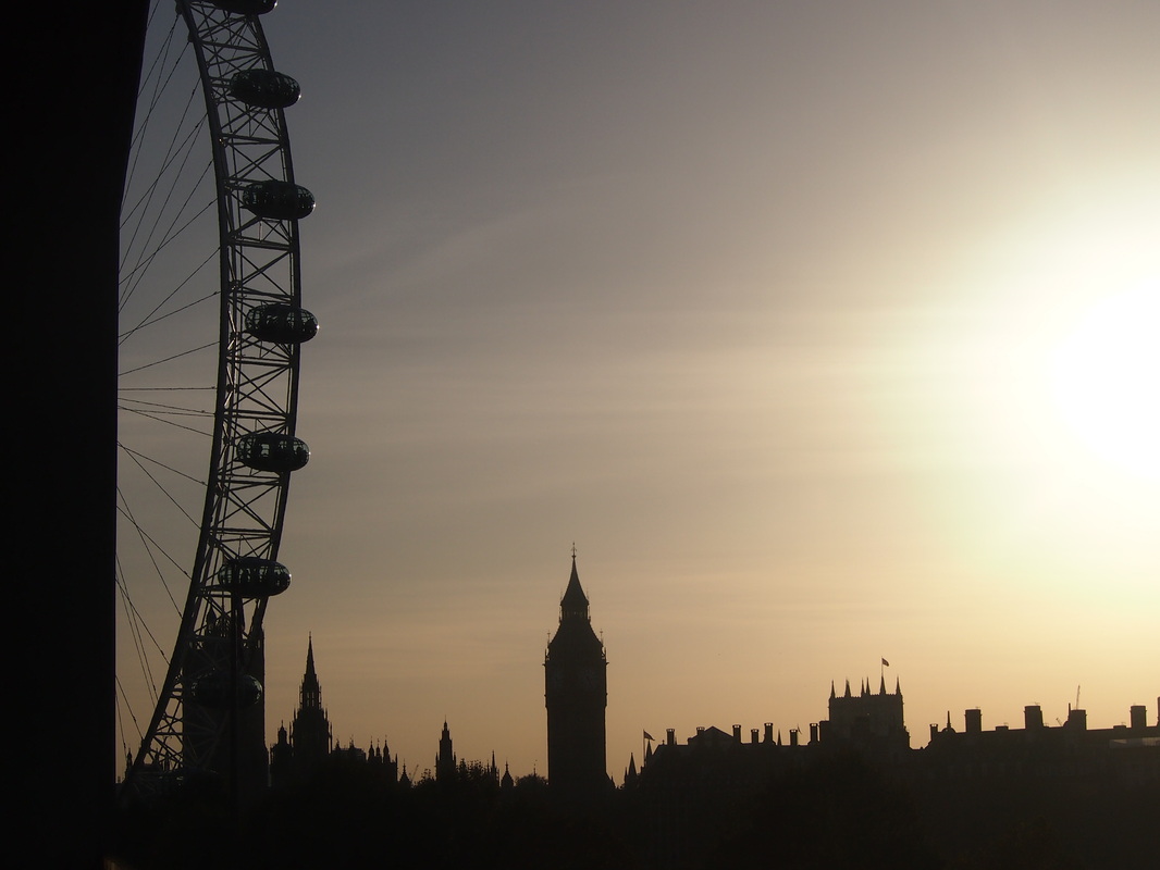
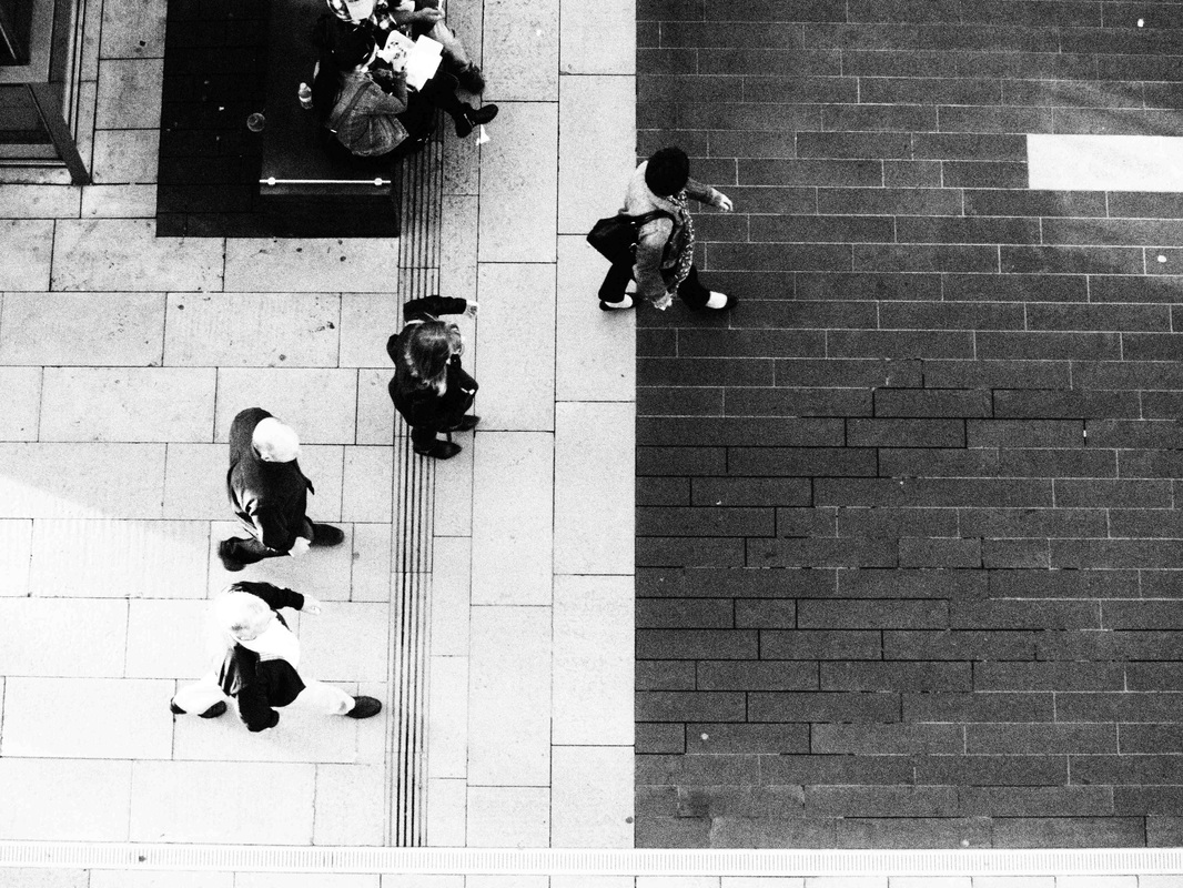
Part 2: London From Above
For my second set out of my 3 themes i chose to photograph the London skyline. To fully achieve and emulate what my theme was all about i figured that going up the London Eye would help me get the best and most photographically pleasing pictures. I went up the eye at sunset. This helped me capture some very nice contrast to work with. Being so high up when taking my pictures allowed me to photograph London from an angle that others may not be able to do as well.


|
|


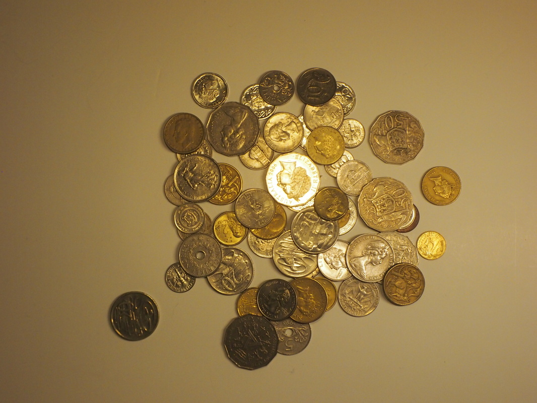
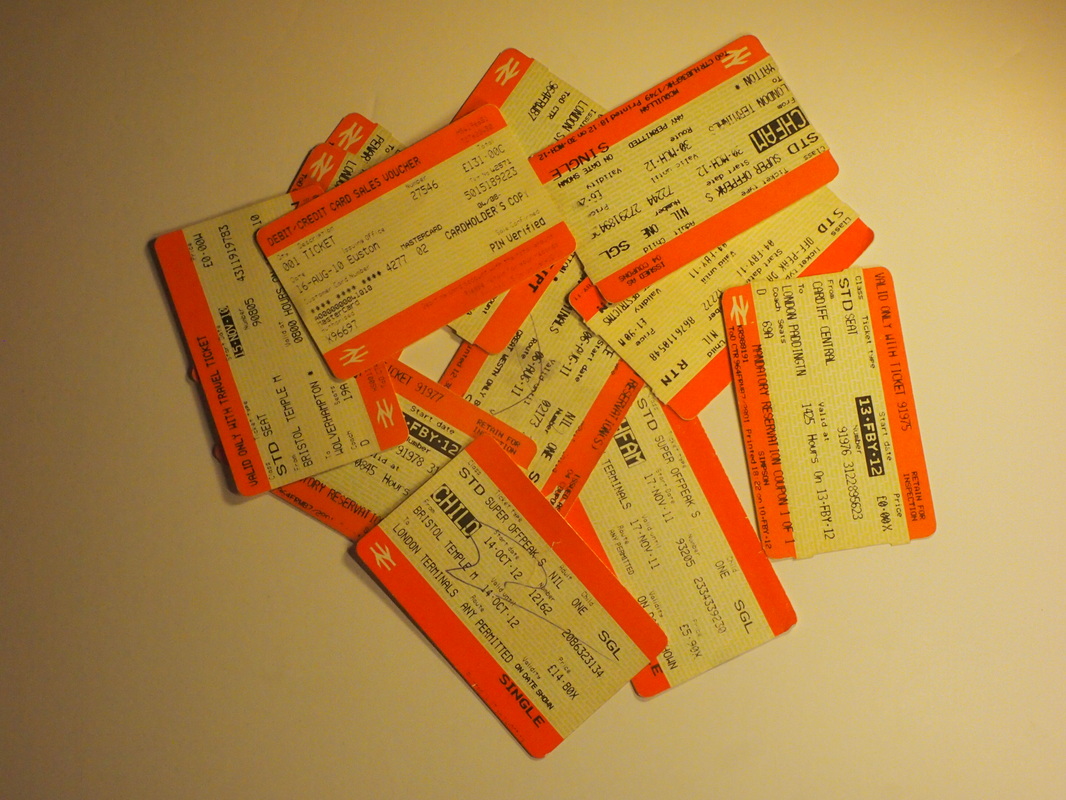
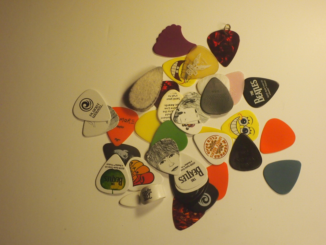
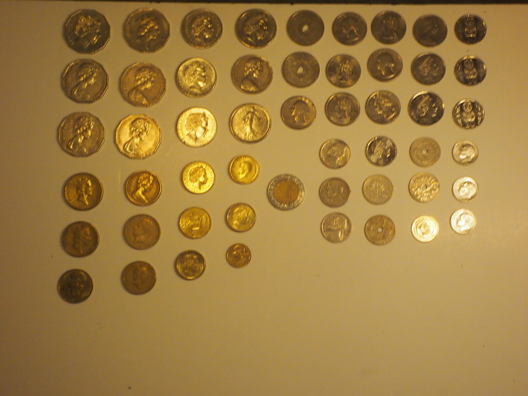
Part 3: Typology
For my third theme i chose to focus on typology in the style of neatness and laying out. By laying out objects in a neat and messy way i can create a big contrast between images. By showing a messy clump of my objects it impairs the viewers ability to fully view and comprehend the objects. By following those pictures with a neatly laid out picture with those objects it allows the viewers to see the objects used in more detail and it helps them notice the harsh contrast between the images.
|
|
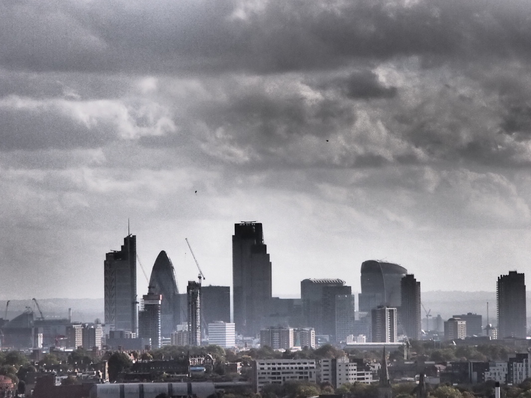
Favored Strand: London Skyline
Out of my three strands i have chosen to continue and pursue my strand focusing on the London Skyline. I've chosen this strand mainly because i enjoyed photographing it the most and because i think the pictures i got out of my first observation were superior to the photographic quality of my other strands included images. As well as this the locations i will visit for pursuing this strand will be more interesting and will be easier to photography due to the advanced photographic opportunities the locations will feature.
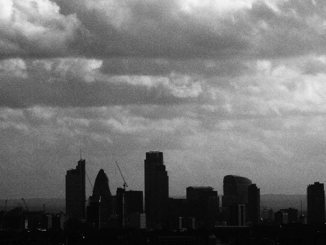
Second Observation Plan
For my second observation i will focus on photographing the London skyline again
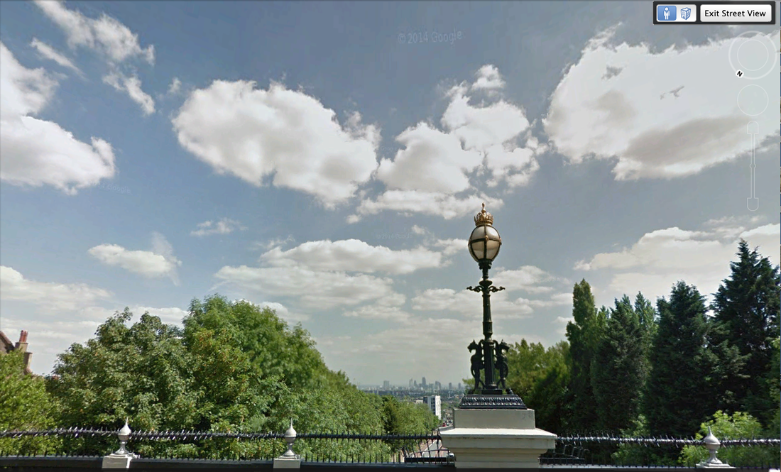
Where: Highgate, Waterlow Park and Hornsey Lane/Archway Bridge
What: London Skyline Views When: Daytime on the weekend |
|
Second Observation: London Skyline

Enlargements
|
|
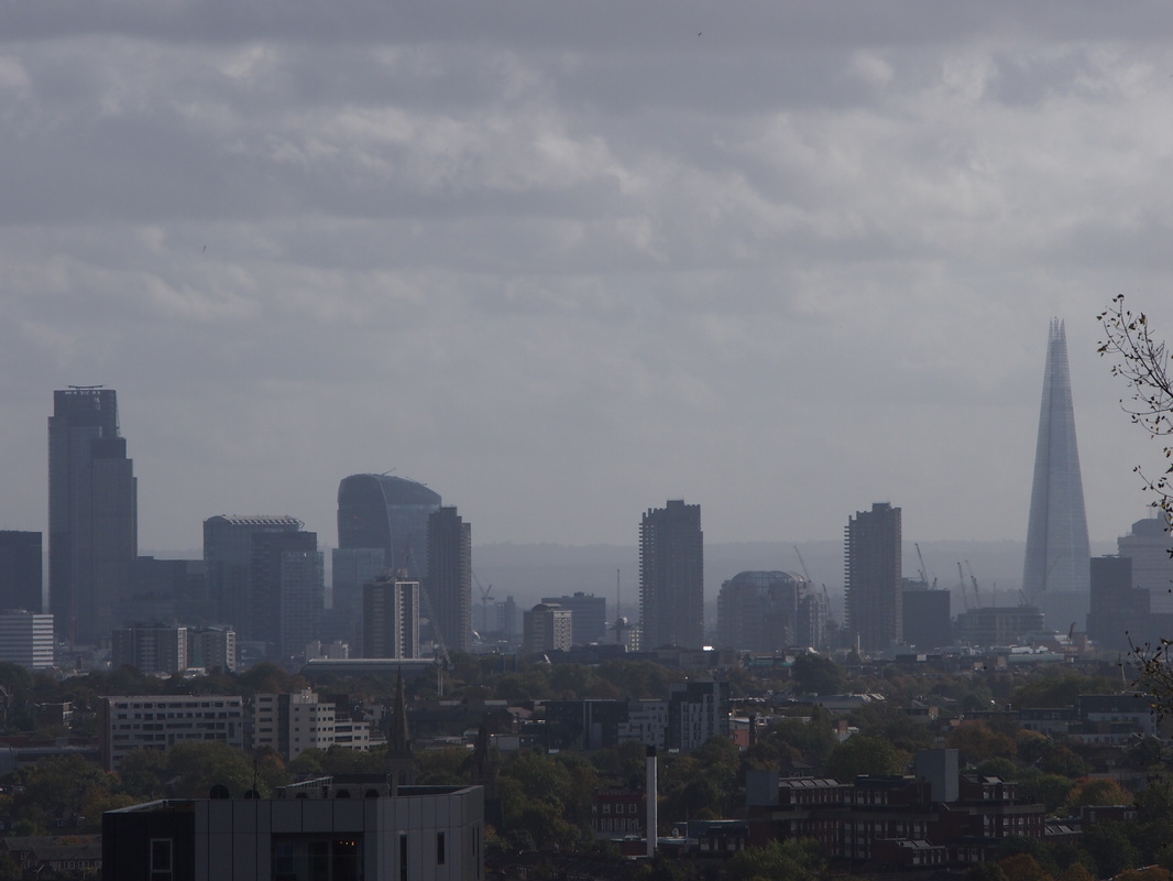
Half Term Homework: London Skyline pt.3
Over the half term i went out to central London to continue to take a set of London Skyline observations.

|
|
London Skyline Pt.4
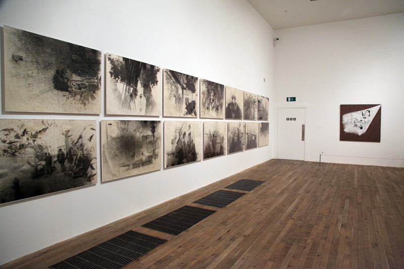
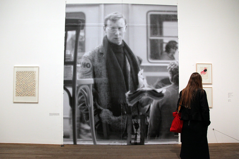
Sigmar Polke Exhibition: Tate Modern
Over the half term i visited the Sigmar Polke exhibition at the Tate Modern, Southbank. The exhibition showed a vast majority of Polke's most well known and famous pieces.

|
|

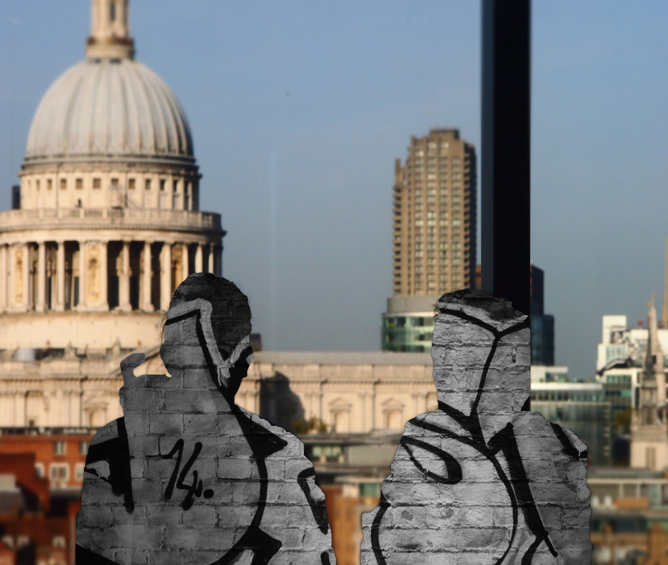
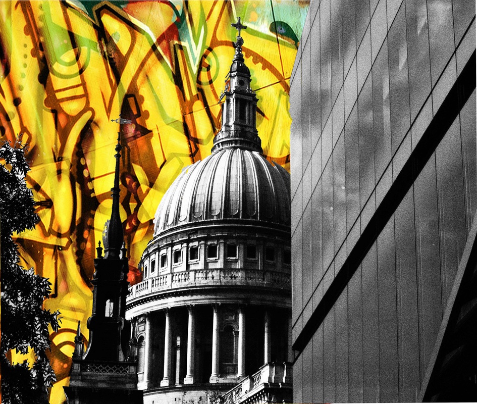
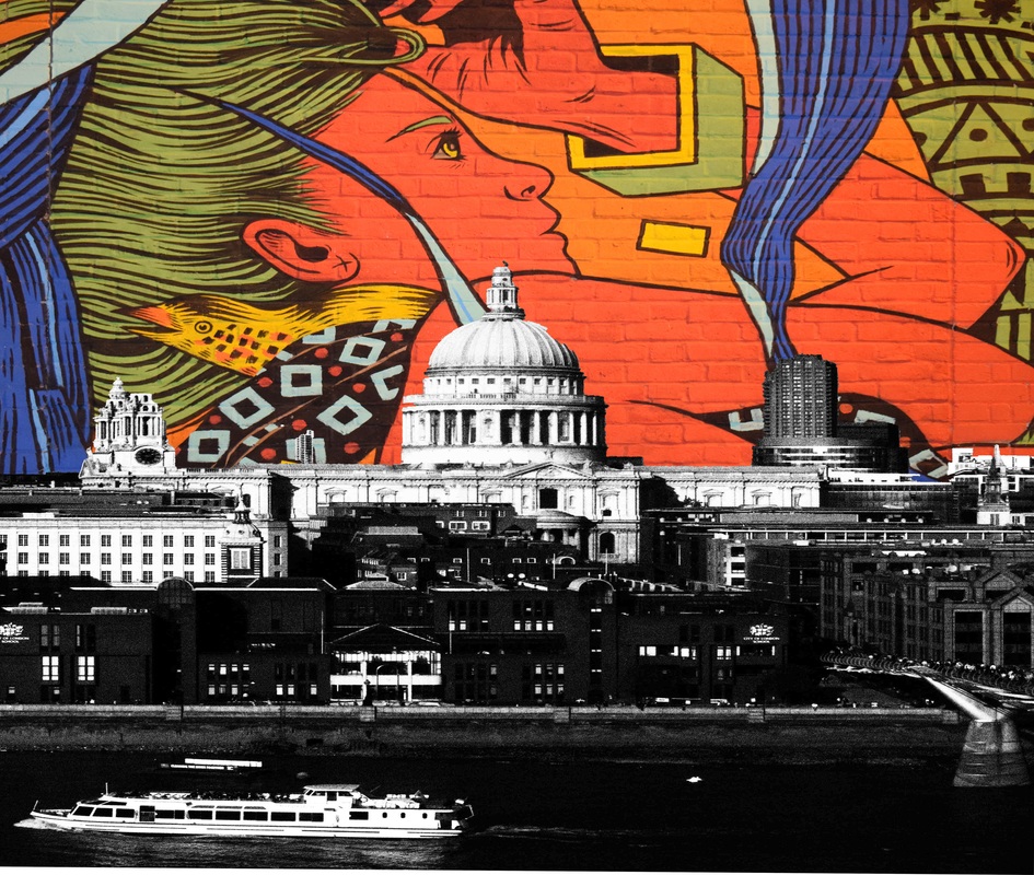
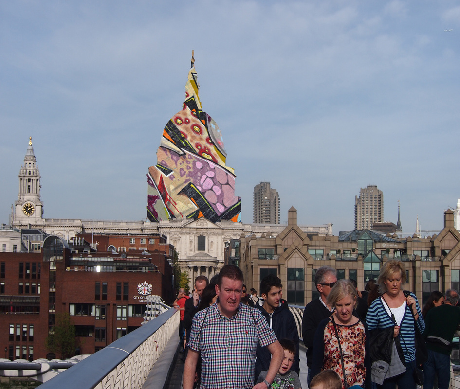
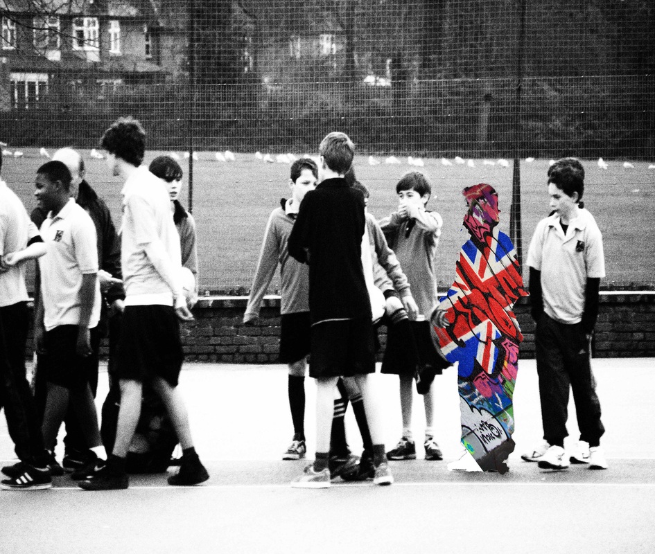
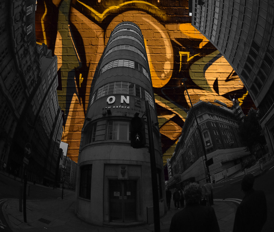
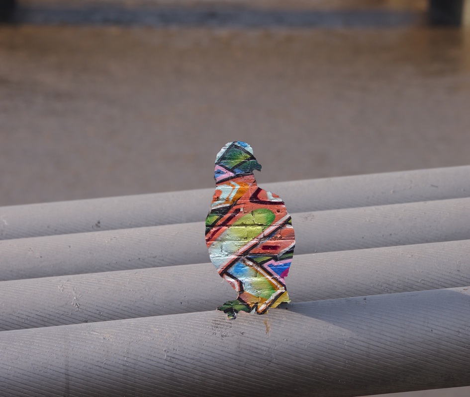
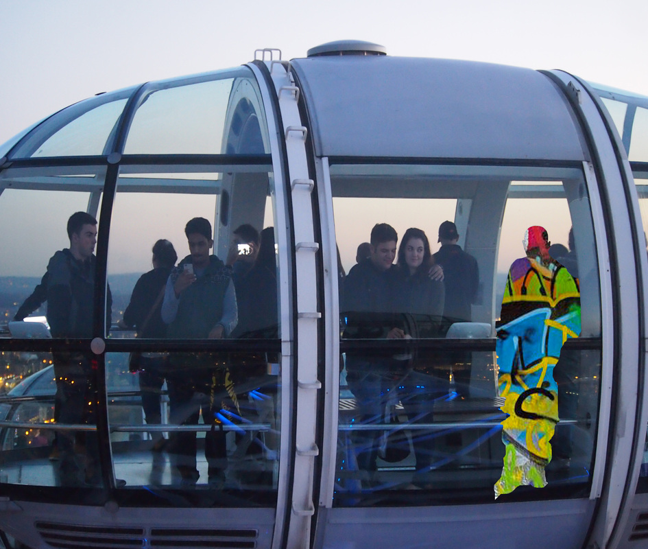
With my final piece my primary objective was to show different sides of modern life in Britain into one singular image. I saw graffiti as a element of modern life that is heavily praised, and criticized. I think this divide in culture attracted me to the fact that my pictures can make street art become a more appreciated part of art culture through the use of a photograph that contrasts it with great man made feats of engineering like St Paul's Cathedral or the Hungerford Bridge. By showing this contrast it gives the viewer a true outlook over London's visual culture without shunning any parts that often go un-noticed or end up being hidden from peoples view of London due to the mixed stigma associated with graffiti art.


|

|


|

|


|

|

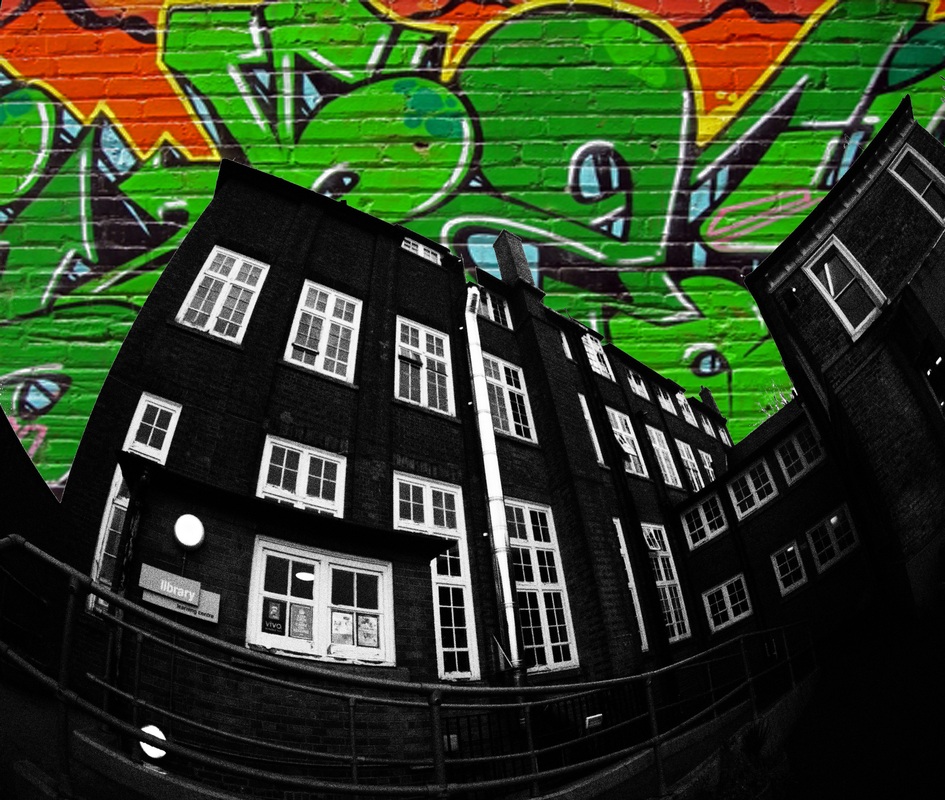
WWW: With this project i focused on showing different sides of London by using harsh contrast between the graffiti colour and the image itself alongside the effect it brings to the viewer. I feel that in some pictures i managed to show this contrast well and used colour and picture grain to show the grittiness of urban graffiti in comparison to the large expansion of modern London and the iconic landmarks it includes.
EBI: I feel that with this piece i could of perhaps used more images that incorporated the graffiti in different ways rather than just replacing the sky. For example i could progress my idea of showing different sides of Britain by taking pictures that relate with different sides of britain more and i could give out a larger impact from the picture by showing the graffiti included in an image that shows either visually rich and wealthy elements as well as visually poor and decrepit elements. I think this would make the graffiti and the images contrast more effective and will relate to my aim of showing the contrast more complex and vary the way i show the large contrast between poor and rich, and graffiti and art.
EBI: I feel that with this piece i could of perhaps used more images that incorporated the graffiti in different ways rather than just replacing the sky. For example i could progress my idea of showing different sides of Britain by taking pictures that relate with different sides of britain more and i could give out a larger impact from the picture by showing the graffiti included in an image that shows either visually rich and wealthy elements as well as visually poor and decrepit elements. I think this would make the graffiti and the images contrast more effective and will relate to my aim of showing the contrast more complex and vary the way i show the large contrast between poor and rich, and graffiti and art.
Hue Experimentation:
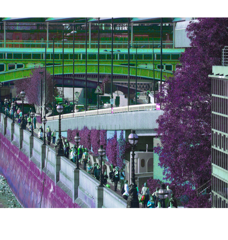
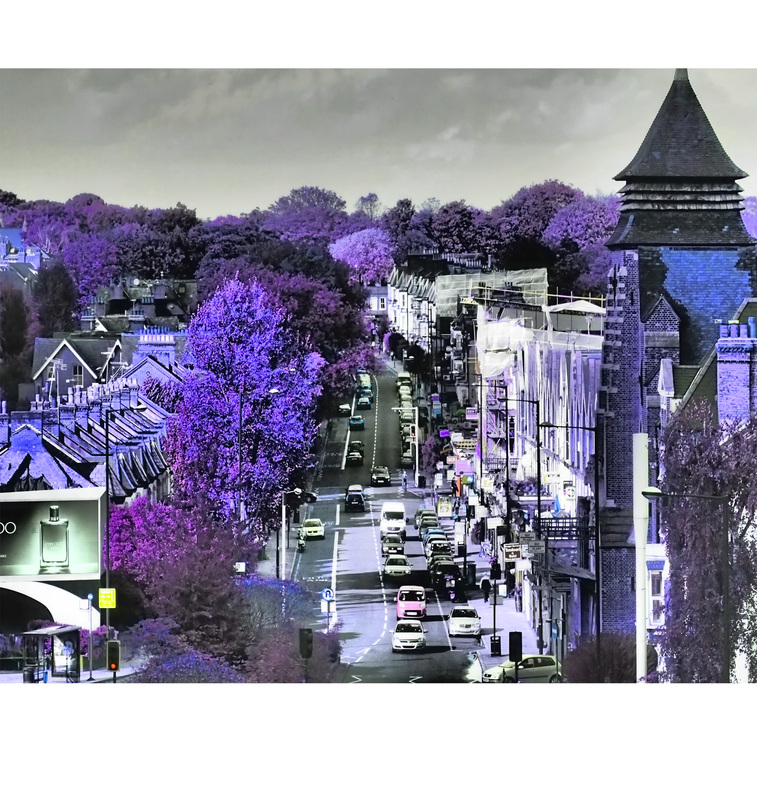
With this set of observations i took street photos showing a bustling city scene and decided to alter the photos in a way which highlights parts of an image that often goes un-noticed. I altered and edited the pictures by changing the pictures hue's. By doing this subtle change, many small parts of pictures have a completely different colour and appearance. This shows that city scenes and the colours people always see are often not noticed, whereas when the colour of the part of the image and the small details around it changes, the image is seen in a different light where every part appears different and stands out more due to the new colour distribution. The different hue's create a vivid and saturated look on a normally bleak and urban appearance of a street photograph. I think the hue's ability to make things look different to how they always look e.g the green trees turning violet, is a expansive way to change the way people see things which was one of my main aims when i set out on this observation.

|
|

|

|

Graffiti Observation: Gilbert & George

|

|
With this observation i was aiming to emulate the photographic work of Gilbert & George. Gilbert and George's "Dirty Word Pictures" is a piece where a crudely written graffiti swear words are placed on a surface. To accompany the rude words, urban shots of London or City life in general are placed in a grid to show a urban and underground view of cities in that time and the culture that it was engulfed in. I attempted to re-capture Gilbert and George style pictures by visiting a local urban place like Ally Pally to show the different fibers of London life by visiting one of it's most popular locations and photograph its graffiti and elements of life that is scattered around the site as a whole.
My Interpretation

Greedy, Underground, Art of Street Art.

Sigmar Polke Dotted Texture:
With this strand i went out with the aim to take pictures of London streets and then edit them, applying Sigmar Polke's dot texture over my photos giving it a grainier yet more complex appearance when from a far and when zoomed in. The dotted texture is effective due to it showing how the colour and concentration of minute dots can make up a picture and how dark parts of an image contrast to lighter parts. This comic like texture over the image brings reminiscence of classic black and white newspaper prints as well as coloured television screens and its digital moire effect. This adds a interesting viewpoint on to an image and shows a ordinary picture in a more in depth and interesting way via elucidating the colour, concentration and contrast of an image and its small minute layers/details.
|
1.
|

In Depth: |
With black and white pictures, the dots correlation and properties are easy to differentiate. With darker parts of an image having closer together,smaller dots and darker dots and lighter parts having fewer dots that are even smaller and less bold.

2.

In Depth:

3.
With coloured images, the minuscule dots in the pictures are sporadically placed around in certain areas to make up a certain coloured section of the image. For example, in this image red is the colour which stands out most. The dots in this part of the image are vastly coloured red with small different coloured dots adding to the images grain and realistic texture of the red paint. This grain makes the picture look like an actual photograph, with all red dots making the texture look too bold, smooth and cartoon like. With red being the primary background which all the other dots contrast to, a vast colour red is more visible to see when the image is in full scale withought the enhancement of zooming in.

In Depth:

4.

In Depth:

5.

In Depth:

